GOAL: Pizza‑Man set out to evolve beyond being just another neighborhood pizzeria. The goal was to create a fully realized brand that honored its long-standing place in the community while positioning it for future growth. It needed to feel bold and contemporary, but with a strong nod to its history—elevating the experience without losing the charm that made it beloved. The branding was just one piece of a larger effort to define Pizza‑Man as a destination: a place with personality, warmth, and just the right amount of irreverence.
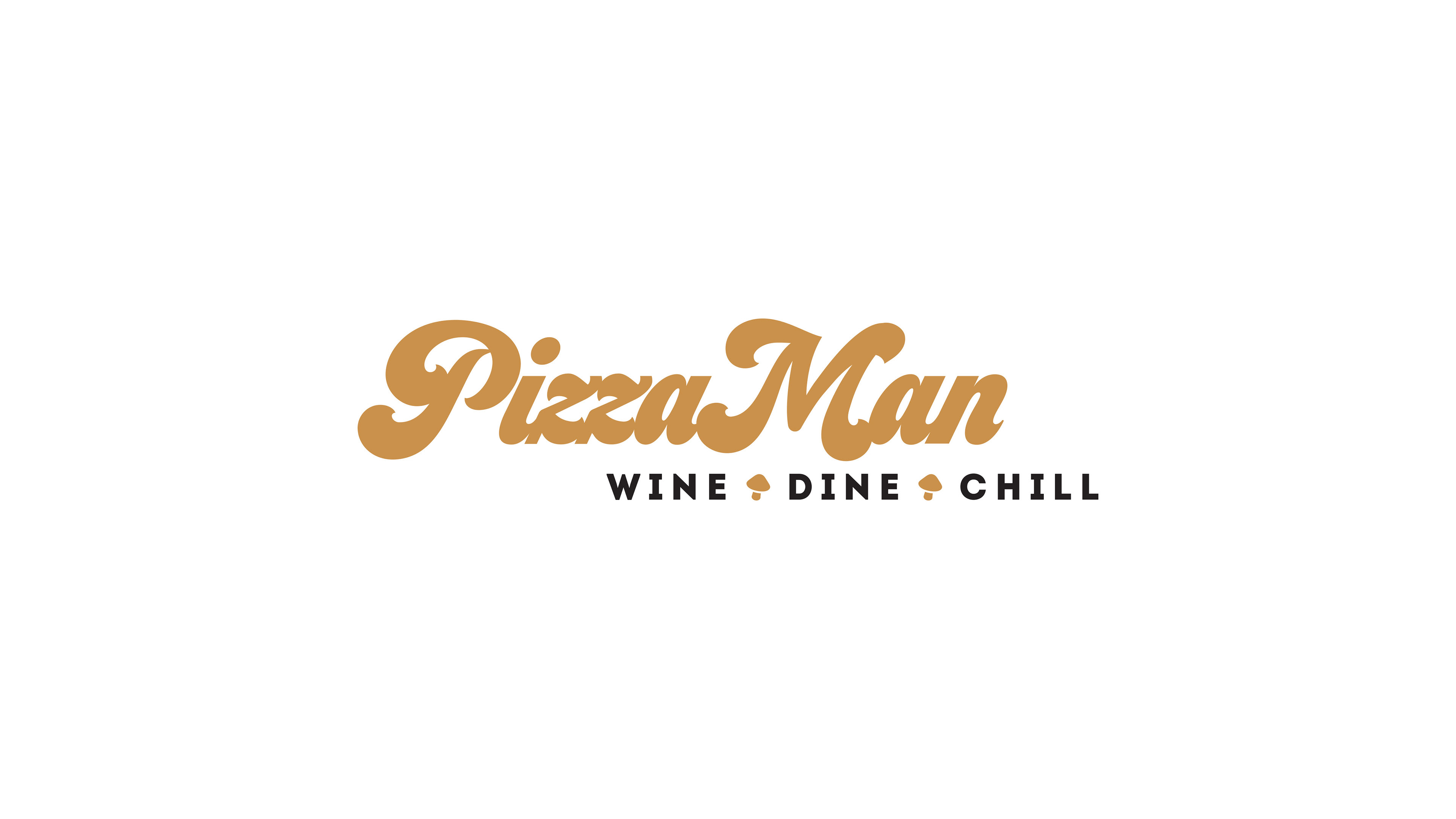
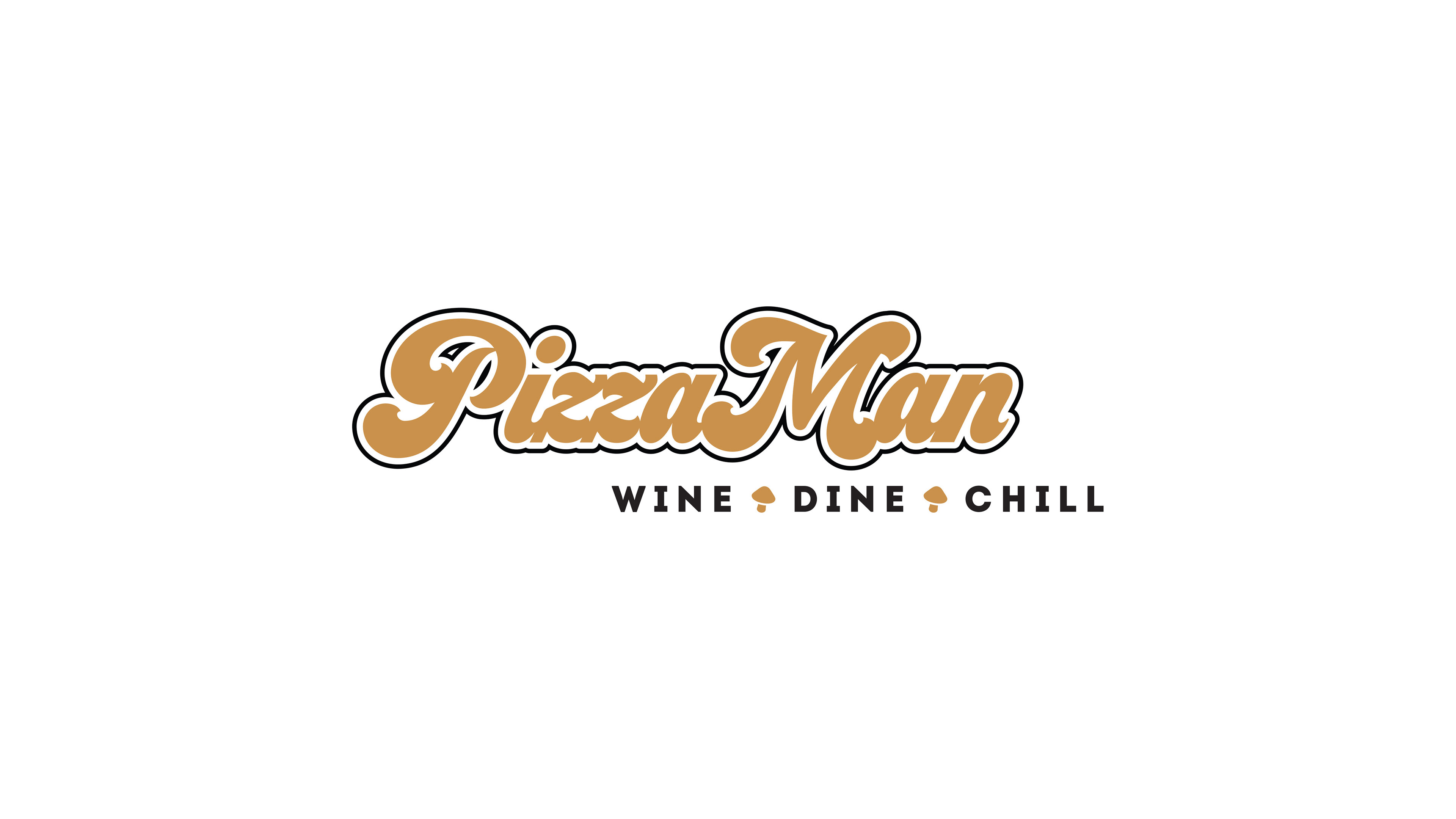
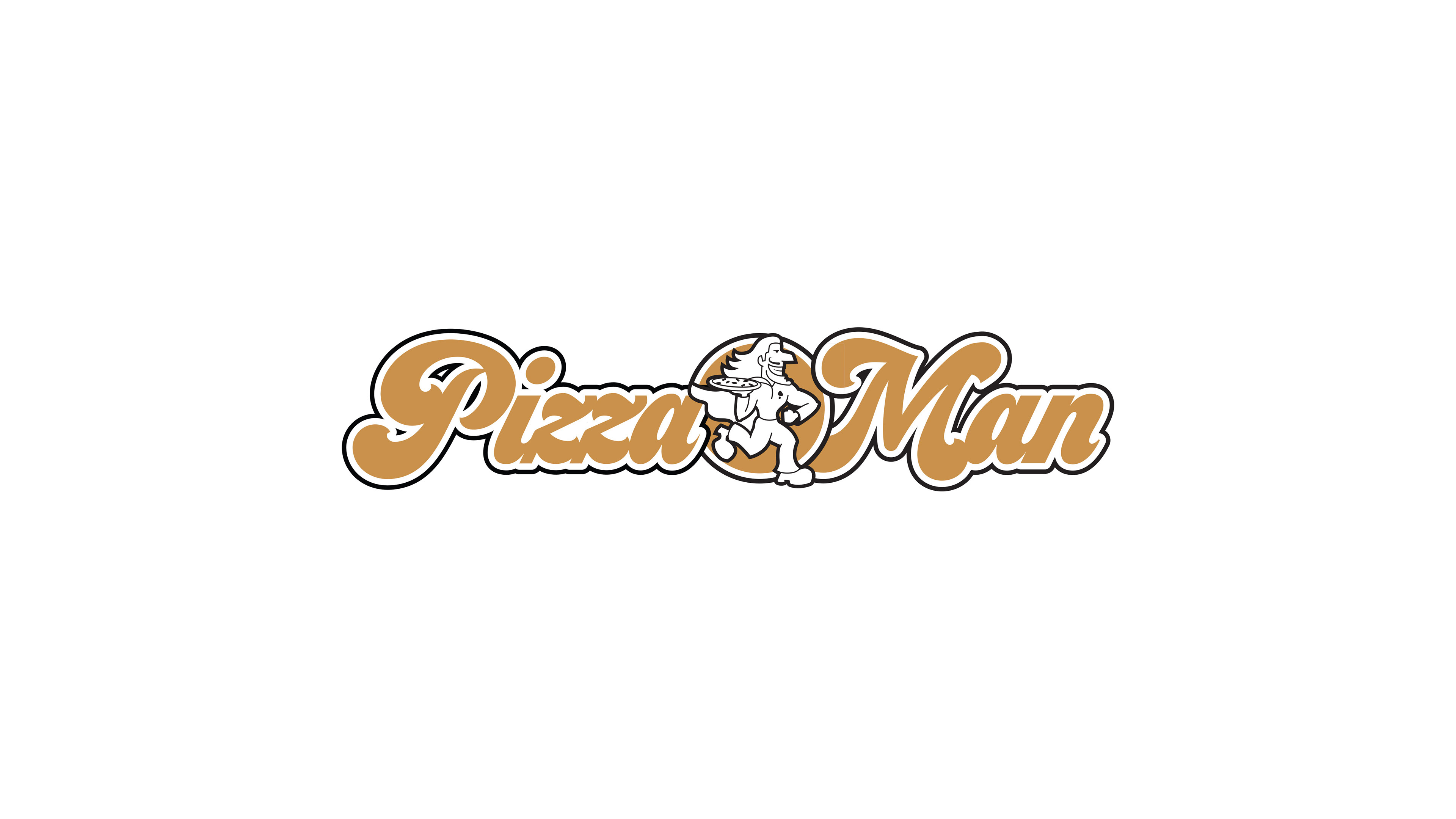
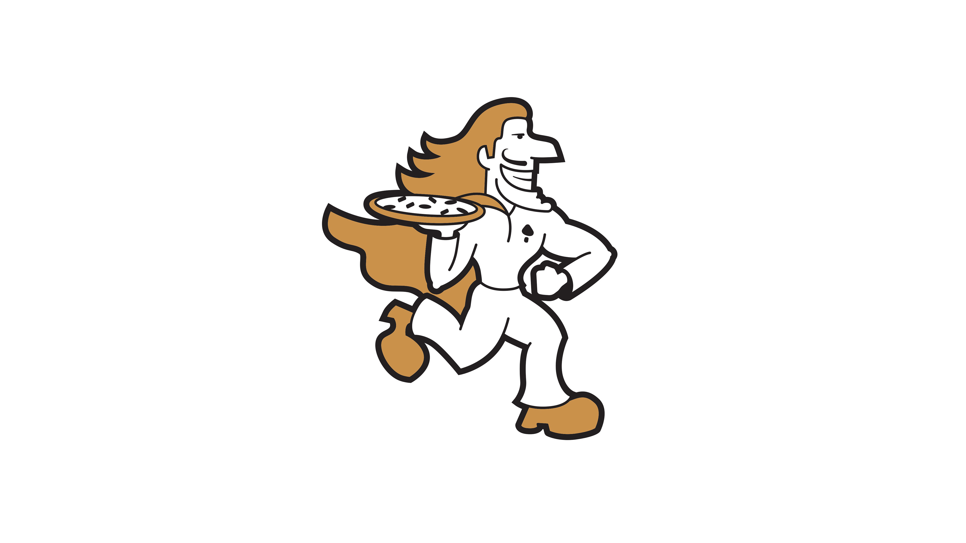
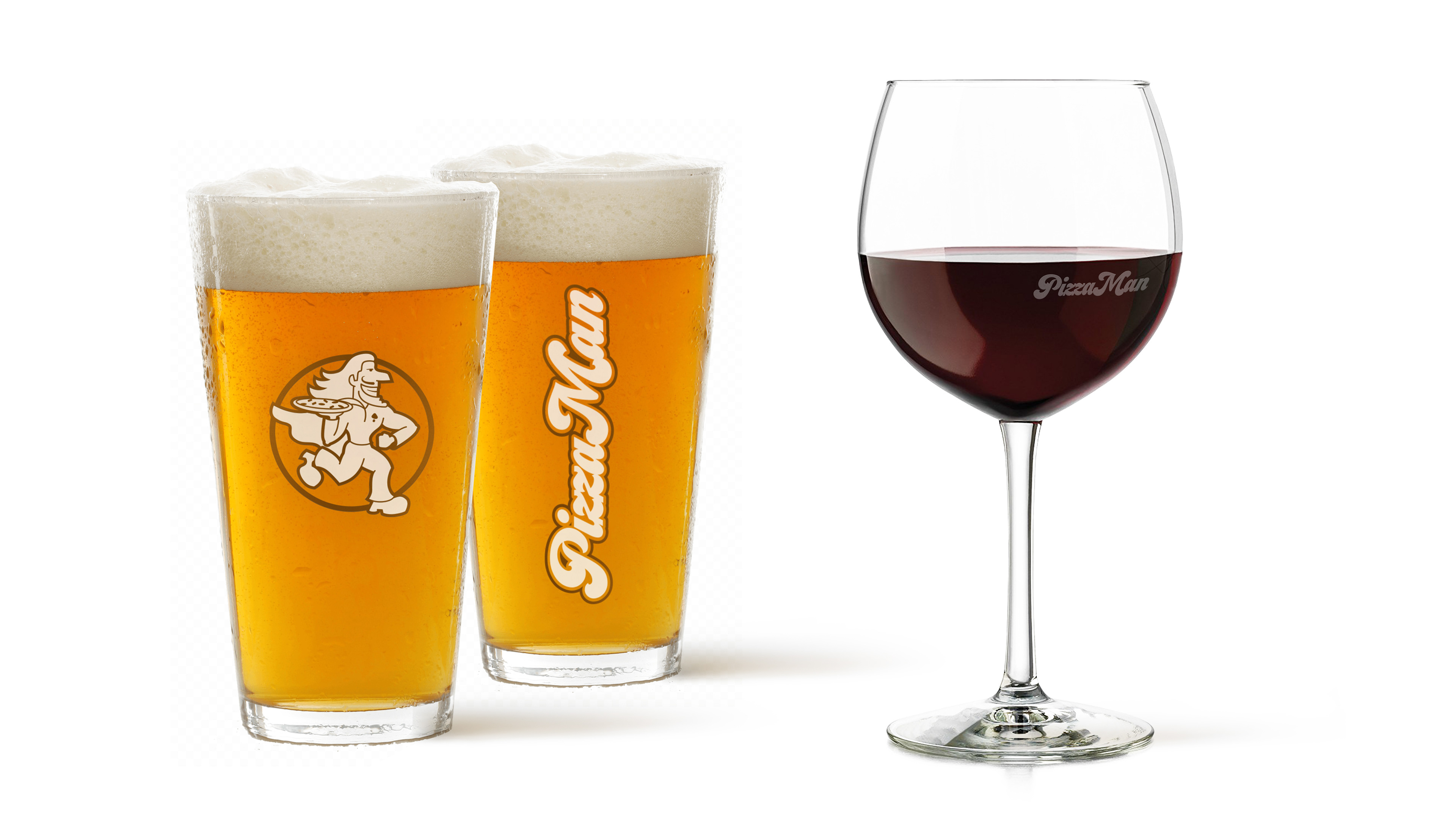
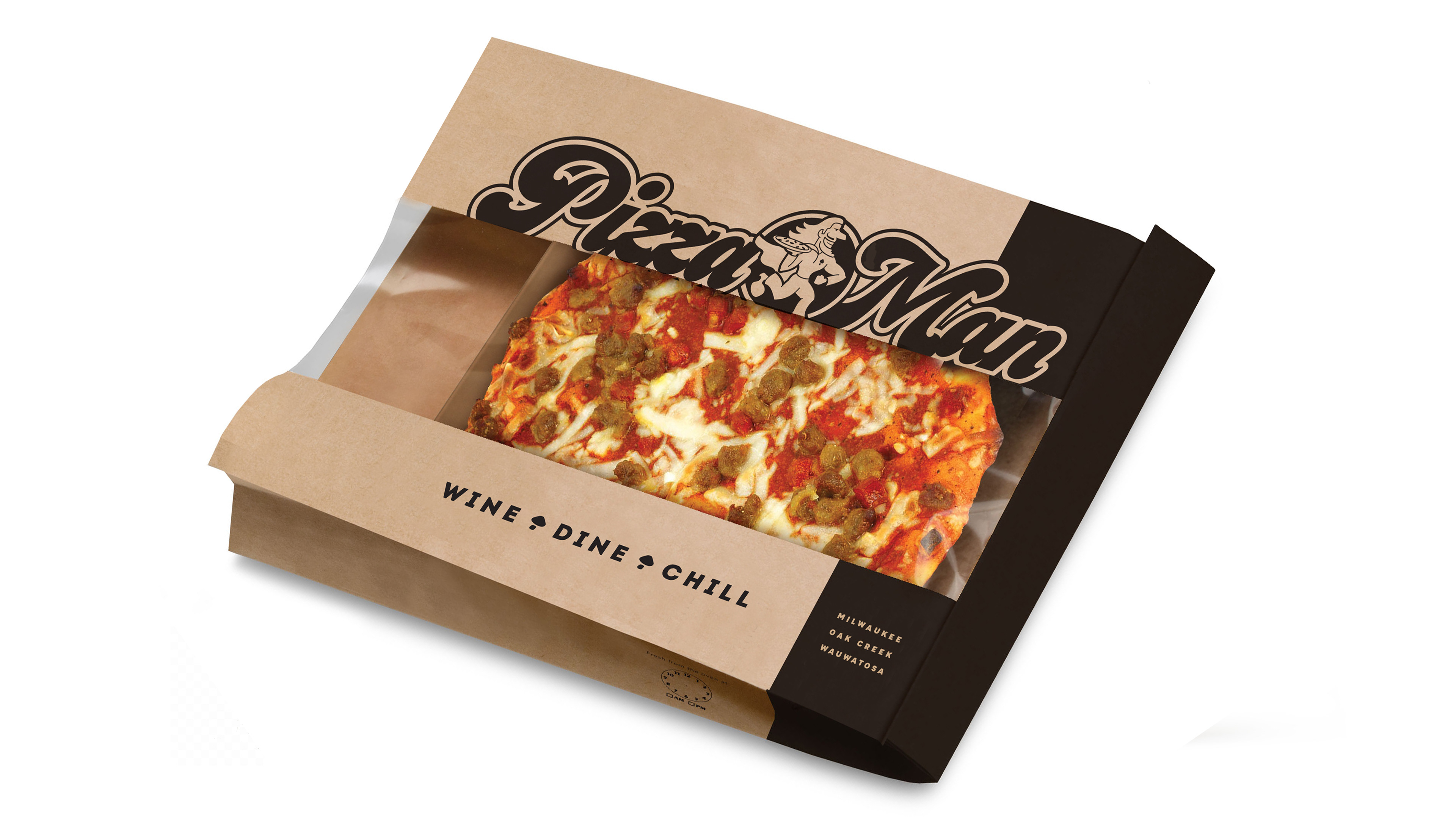
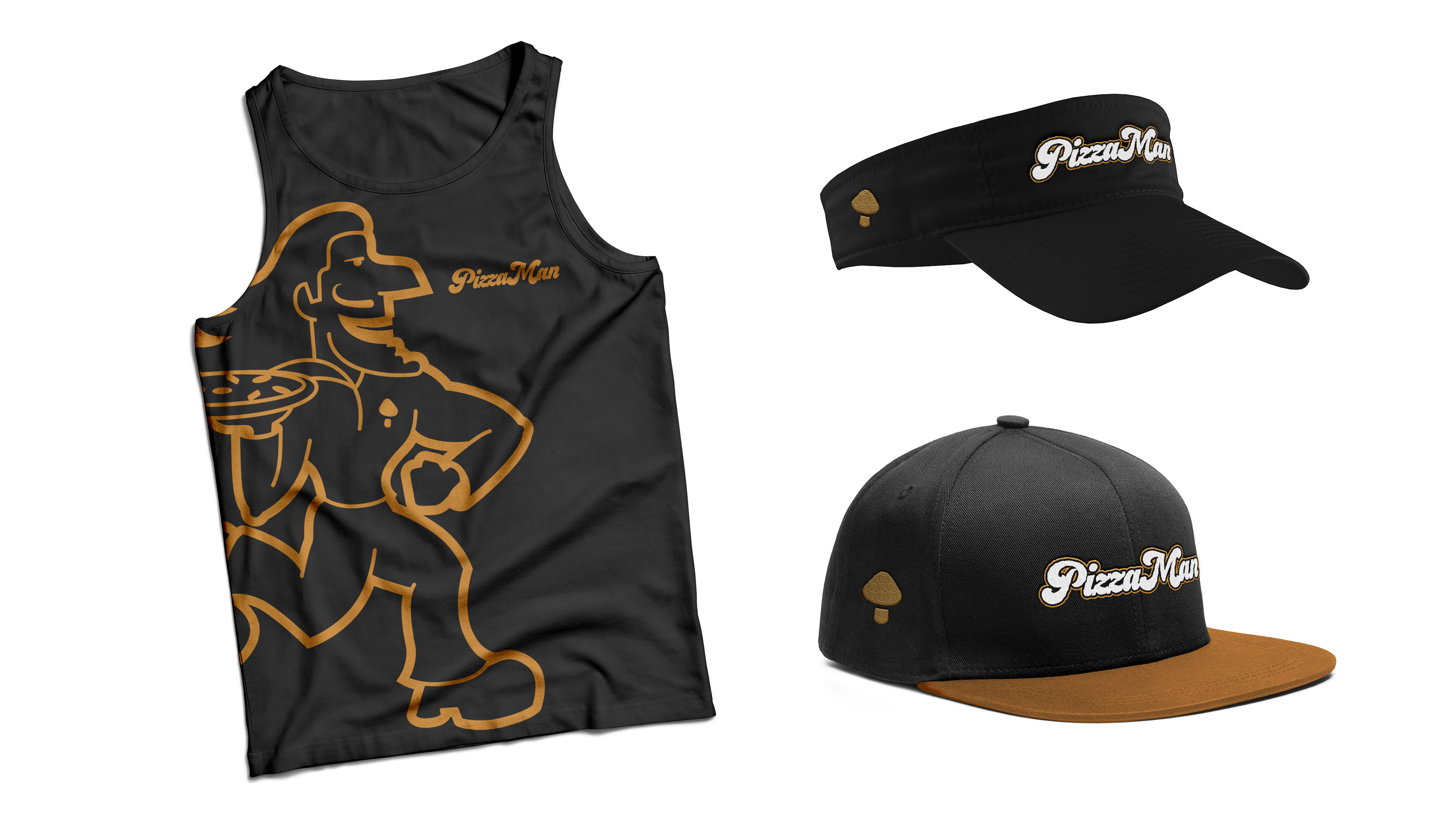
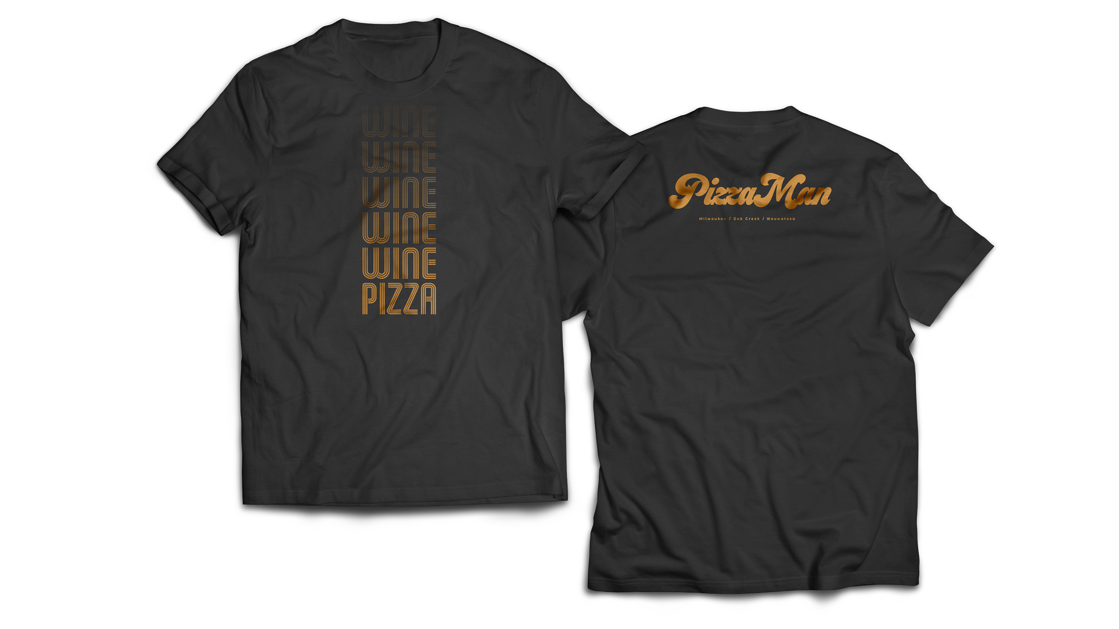
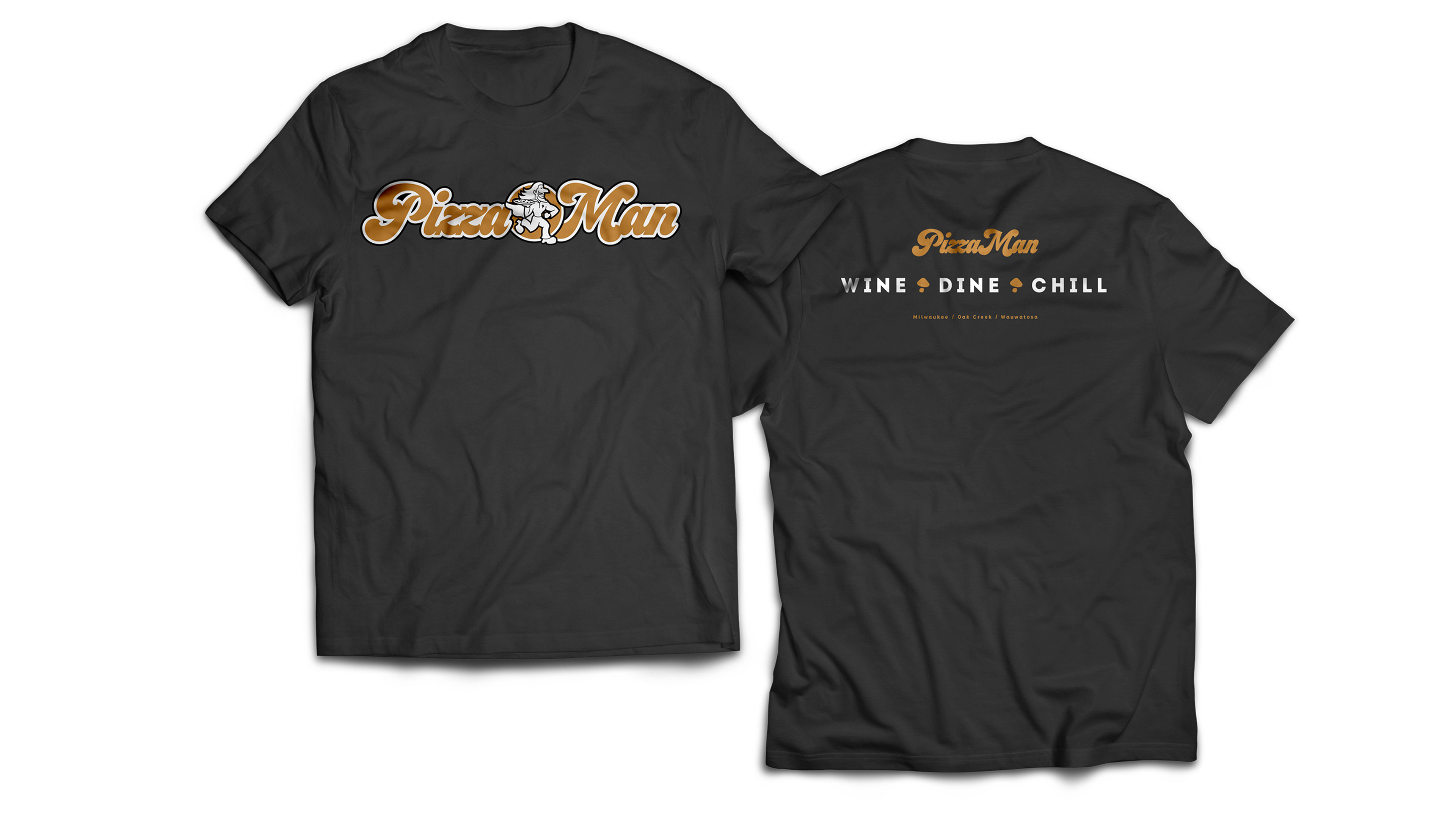
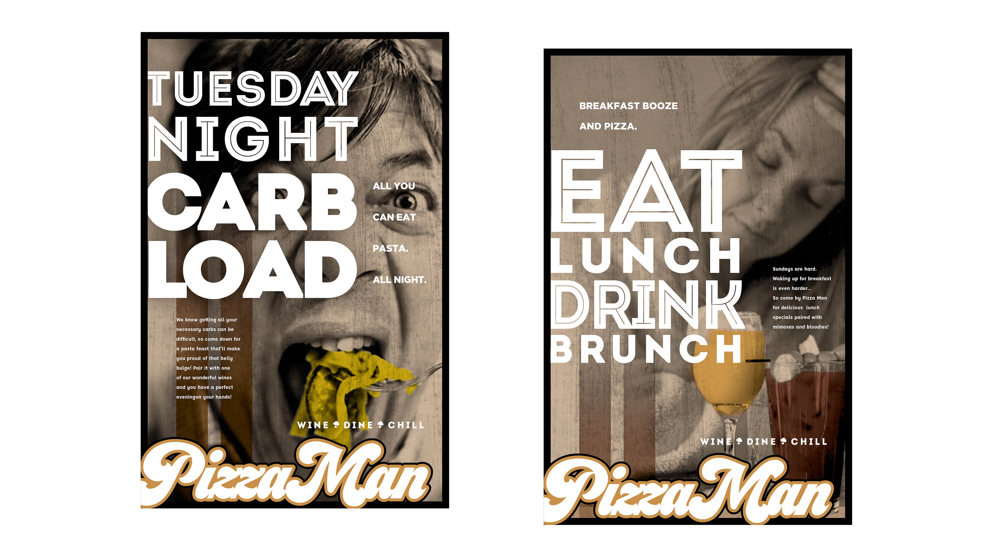
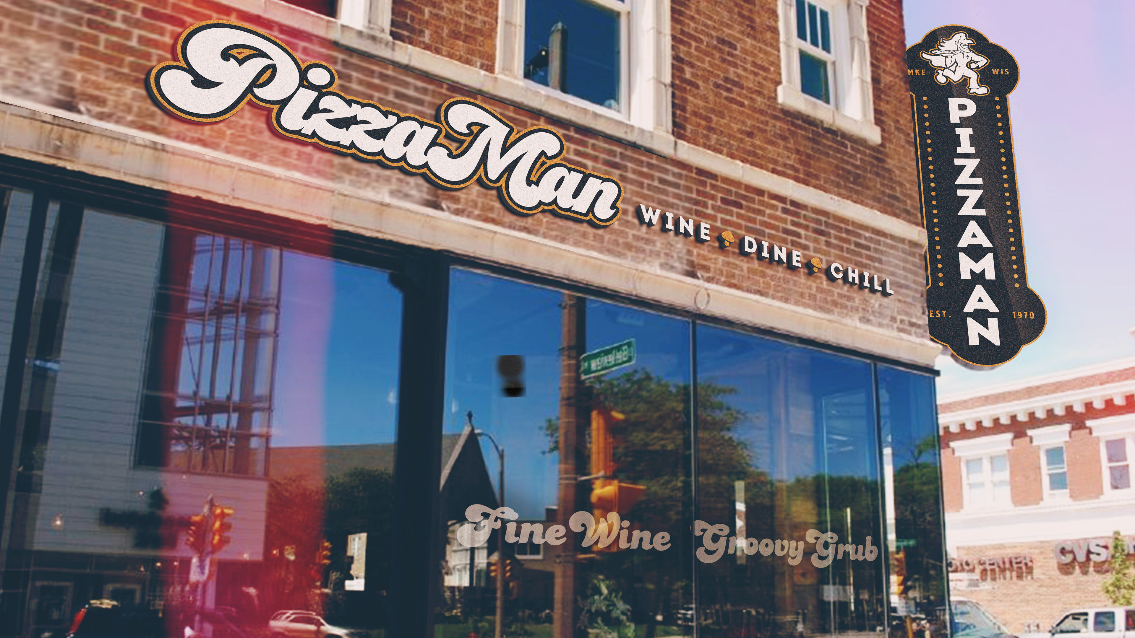
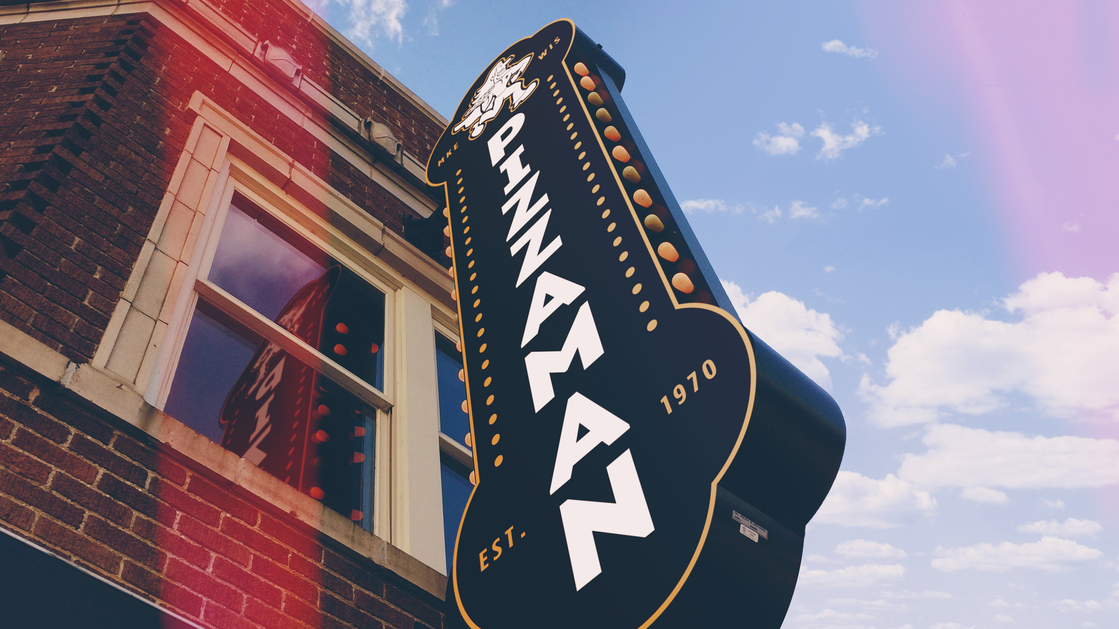
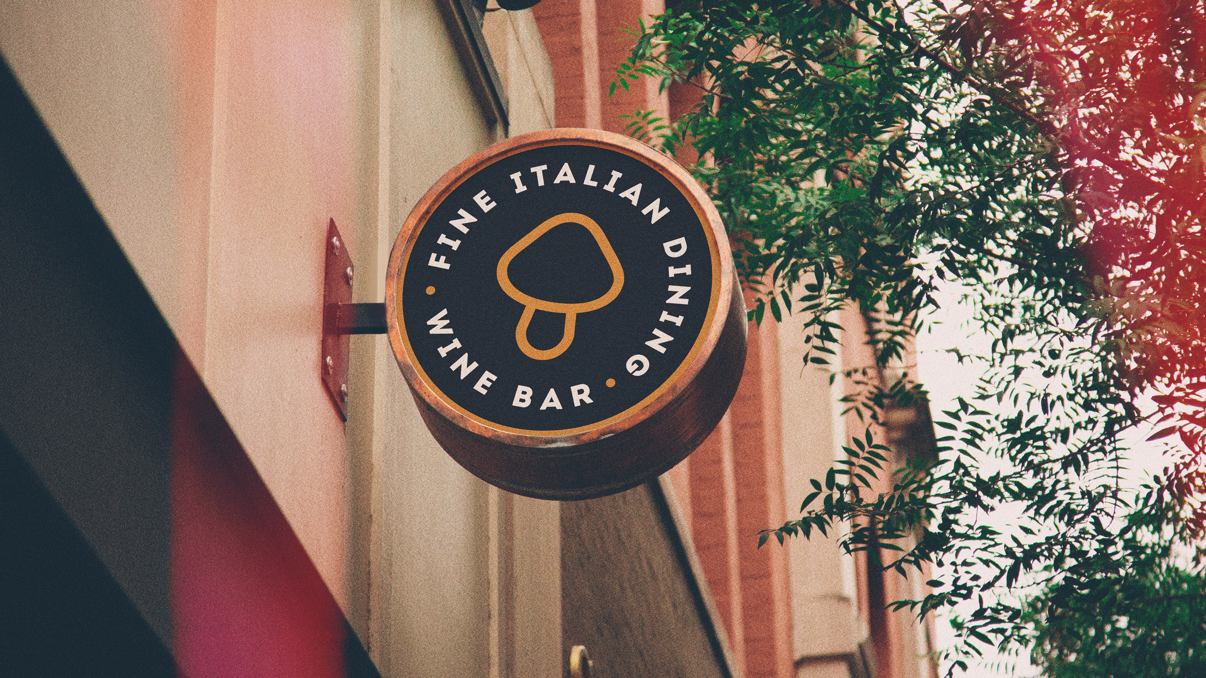
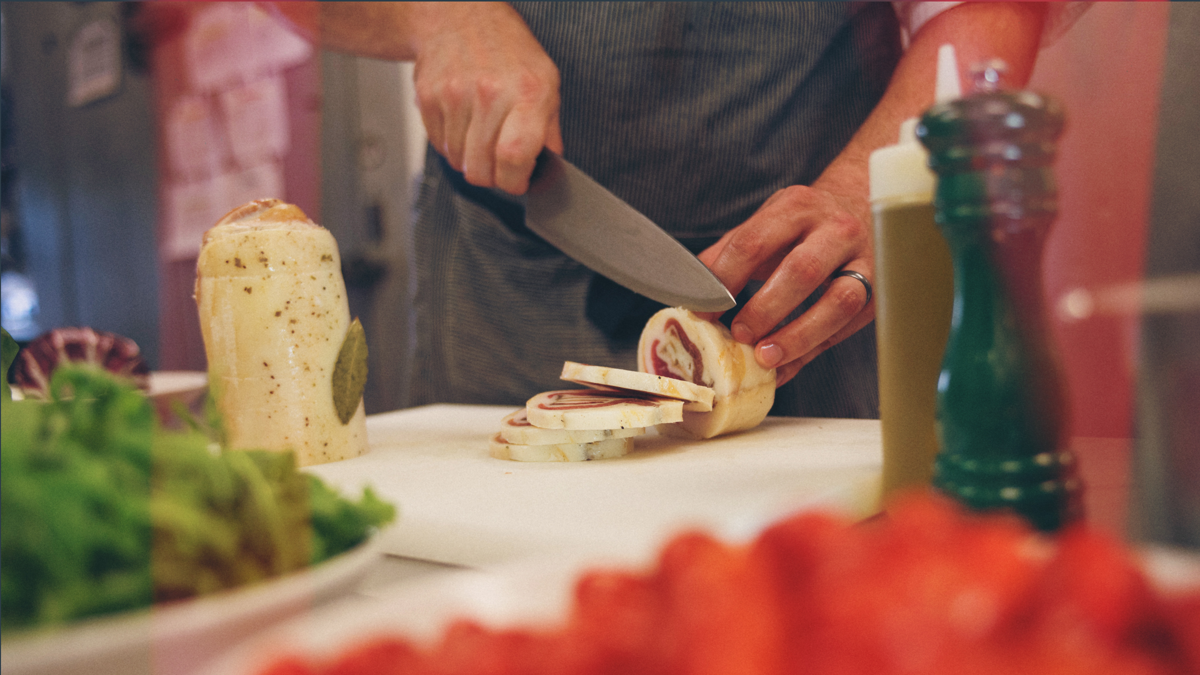
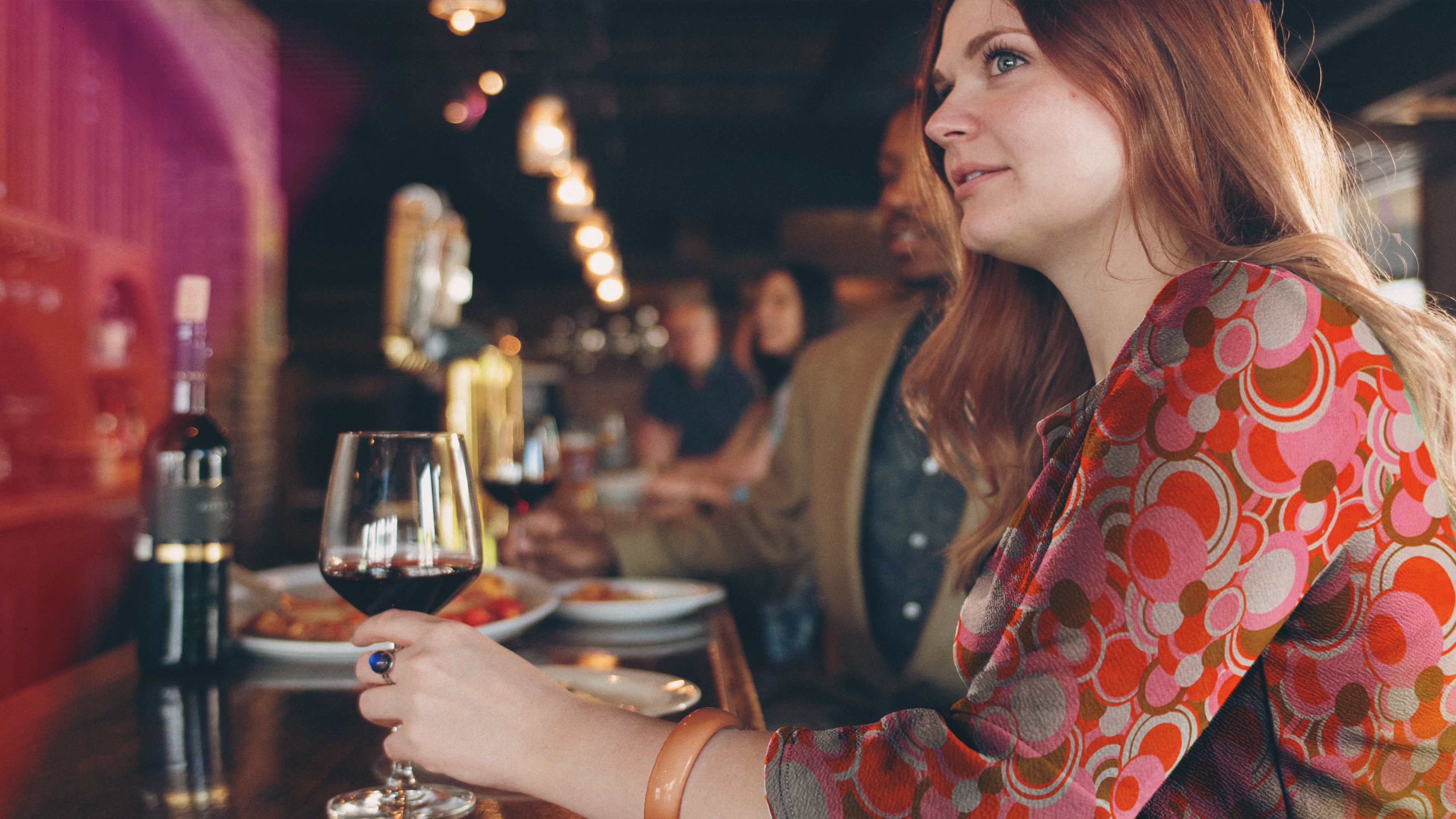
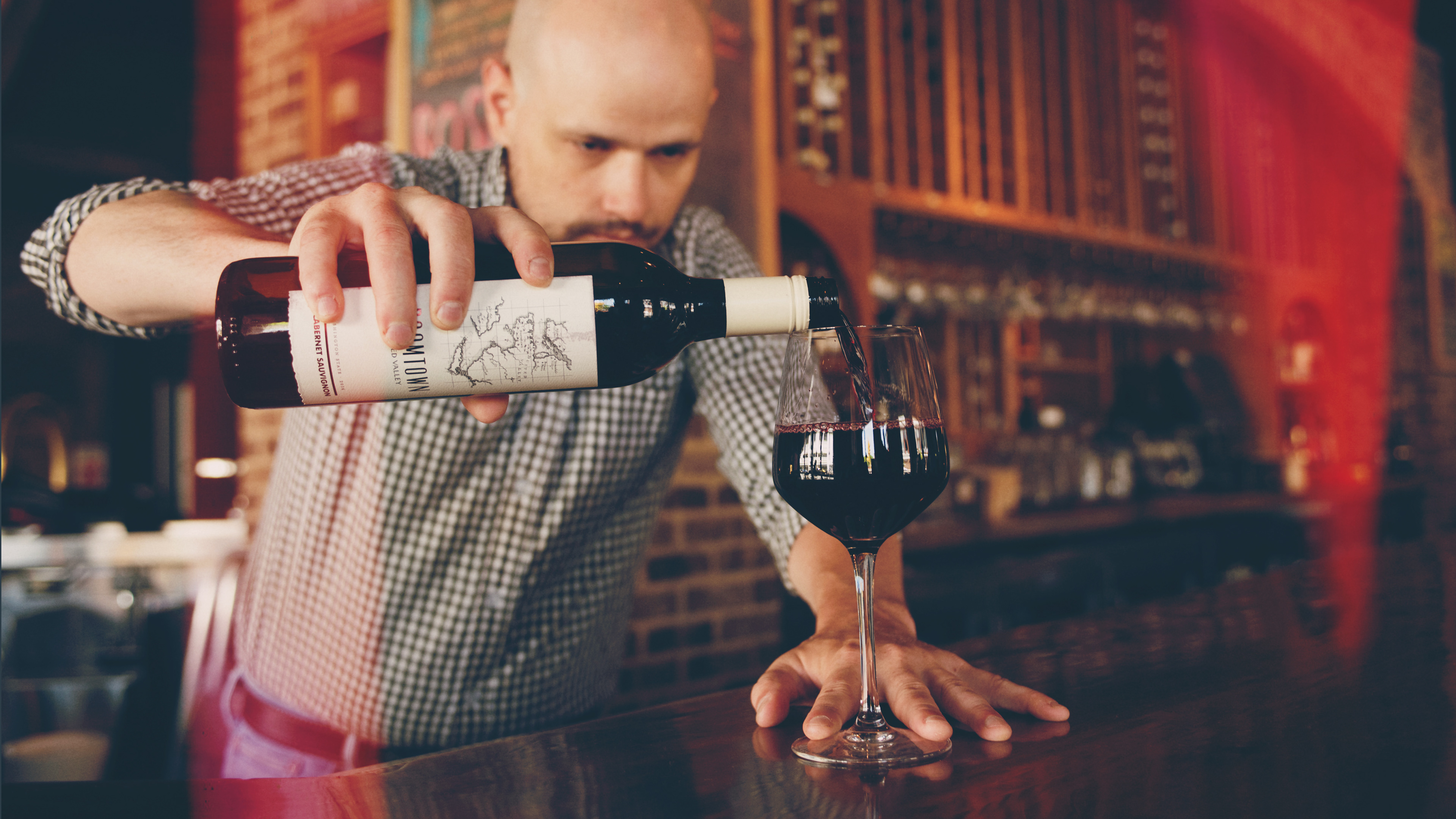
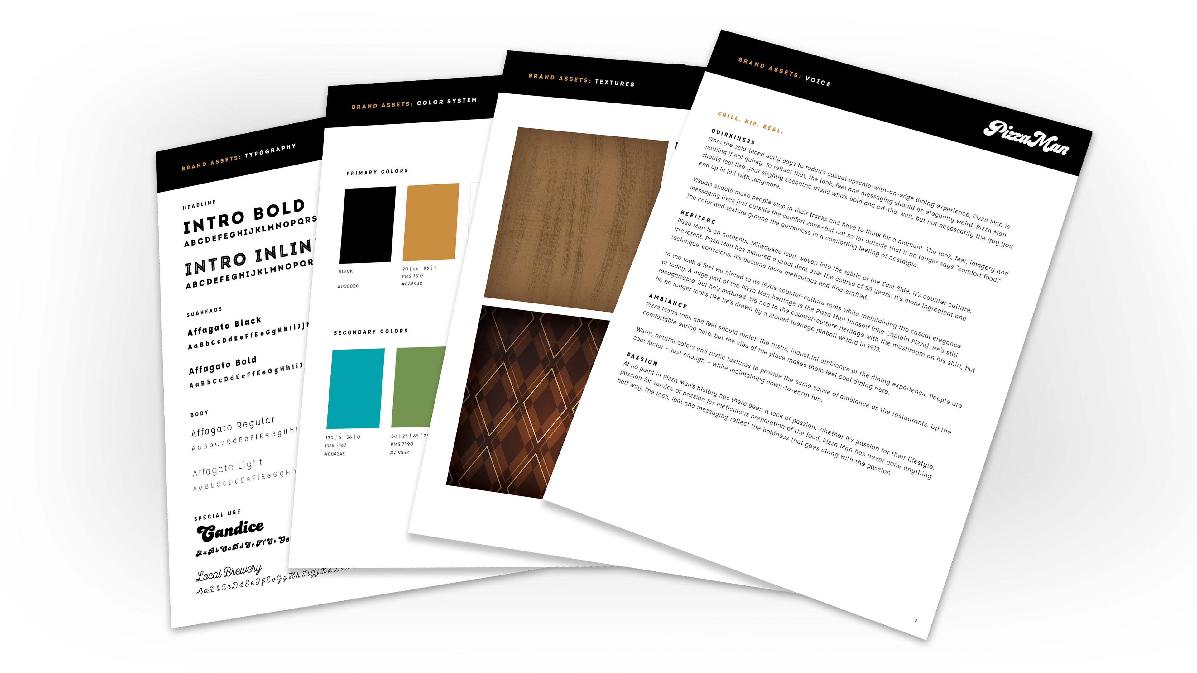
RESULTS: The solution brought together expressive visuals, thoughtful language, and a cohesive brand system rooted in approachability and delight. The Pizza Man logo was given a modern look with a nod to the history of the 1970s... incorporating the tagline "Wine. Dine. Chill." to encapsulate the casual elegance the brand was encapsulating. The Pizza Man mascot was updated and modernized slightly, lending both character and memorability. A saturated palette of reds and yellows, tempered with a deep charcoal, added energy and contrast. Typography, iconography, signage, packaging, and in-store elements were all carefully designed to reflect the brand’s playful nature while delivering a polished, consistent experience. The result wasn’t just a new look—it was a redefinition of Pizza‑Man as a place with purpose and presence. The rebrand positioned Pizza‑Man to stand out in a crowded market, with a distinct voice and visual language ready to scale. It elevated the brand into something more lasting and intentional—grounded in its legacy but built to thrive well into the future.
Unfortunately, a last-minute change in management brought new goals for the franchise, and the full system was never implemented. Still, the work stands as a strong example of how strategy, storytelling, and design can come together to shape not just how a place looks—but how it feels.